Introduction
Overview
3HK is a telecommunications company based in Hong Kong.
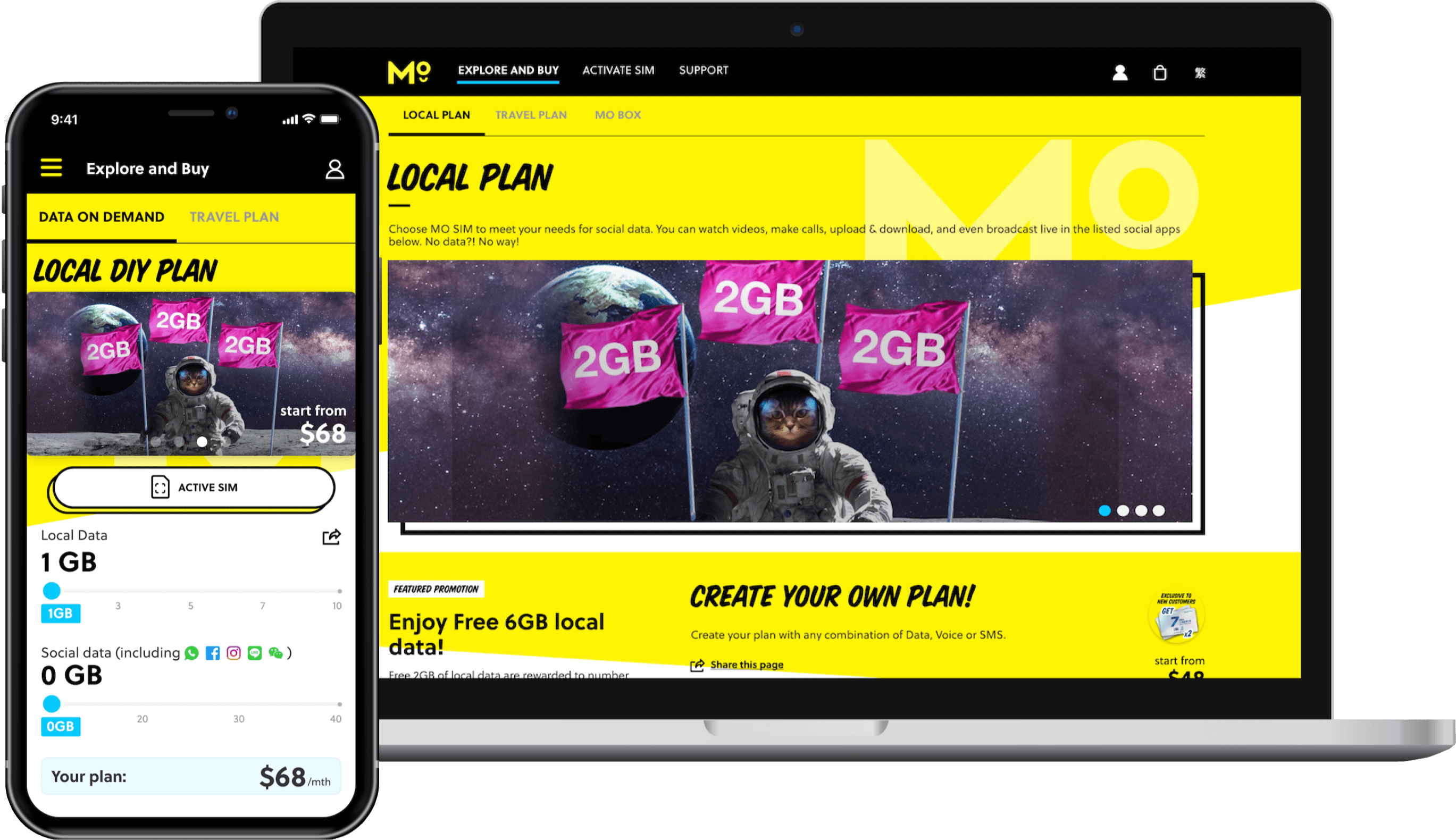
As part of its digital transformation, the company has a pioneering product, MO, which provides mobile telecommunication service in Hong Kong.
Role
UX Designer
Product Strategy, User Research, Interaction, Visual design, Prototyping & Testing, Information Architecture
Date
Mar 2019 – April 2020
Platform
Responsive web app
Background
The product MO had already been in beta operational for roughly a year when my team was brought on board, following its initial design by a different agency. There was a business strategy in place to transition the product onto a new system, necessitating a fundamental redesign of certain aspects. This presented us with a valuable opportunity to thoroughly review and enhance the entire customer journey.
A pioneering product for digital transformation
- Implemented a design process
This initiative has assisted our team in establishing a more structured approach to our work, enabling other teams to gain visibility into our upcoming sprints. - Enhanced usability across the platform
We proactively engaged in UX research and usability testing, ensuring that the platform maintains its user-centric focus, even as the business experimented with new product features. - Laid the groundwork to the whole digital transformation project
Amongst various functions, though some are not released simultaneously with the product launch, the groundwork laid during the design process contributes to the development of the entire digital transformation project.
Process
Our process is based on the Double Diamond Theory and Lean UX process. We aim to incorporate the key phases of Discovery, Definition, Ideation and Implementation.
Understanding the problem
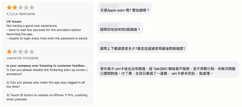
Before our team joined this project, MO had been launched for about a year. I conducted market reviews and tested the existing app with some potential users to uncover any pain points that they were experiencing with the beta release.
My research encompassed:
- Understanding the user goals and needs
- Uncovering pain points with the existing user journey
- Determining the success of the tasks measured
Gathering insights
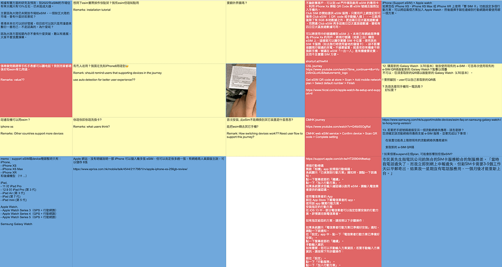
After collecting the recordings from the user interviews, I conducted affinity mapping with my teammate to synthesise the pains identified. We grouped these problems under common themes and features in the existing product.

Upon reviewing the market, we discovered that customers were eager to try our new service due to its affordability. However, they expressed reservations about committing to a subscription due to the unfamiliarity of the subscription method. We also identified a discrepancy between customer needs and issues with unreliable logistics.
We also conducted research about our direct and indirect competitors in order to have an overview of the strength and weakness of the existing market. It helped us to have a solid base to start sketching and wireframing the user journey.
As a telecommunications service provider, we are required to adhere to a comprehensive list of government regulations. Additionally, the business has security requirements that necessitate careful consideration and effort when designing the front-end platform.
Narrowing down the scope
Narrowing down the scope was a challenge due to legal and business regulations. For instance, the subscription procedure which required customers to provide an extensive amount of personal information when using the service. Meanwhile, business users were keen on gathering as much information as possible for future marketing initiatives. To address this, we made the product options simpler, enabling customers to complete the subscription process in the shortest possible time. We also guided customers on how to add or customise their subscription settings and provide additional information once they began using the service.

Wireframing the solution
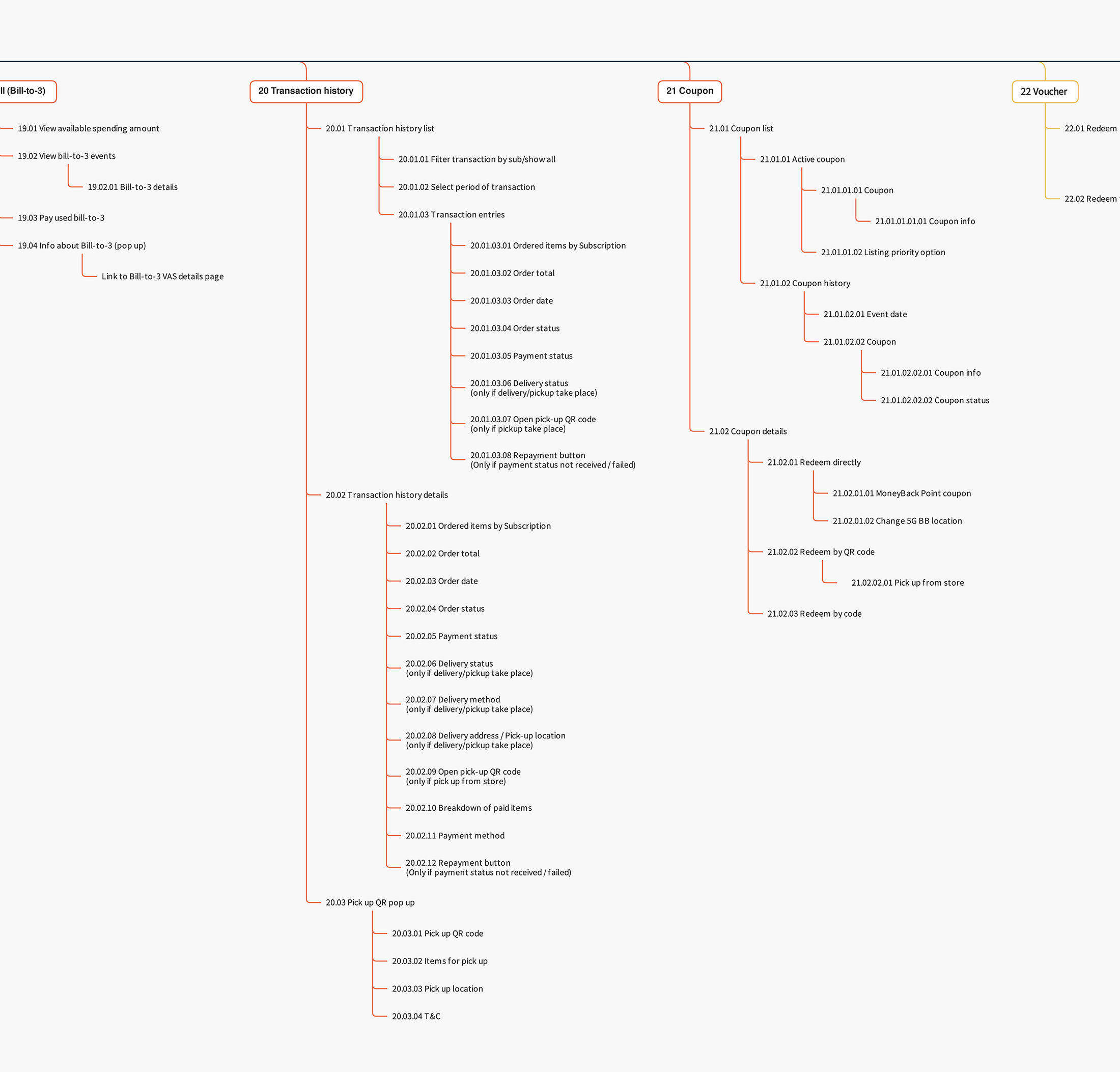
As there were numerous functions, one of the difficulties of the design was arranging those functions in a way that makes sense to the end users, which brings us to information architecture. We conducted some tests, such as card sorting, to help us group the functions logically. We then created wireframes based on our findings.

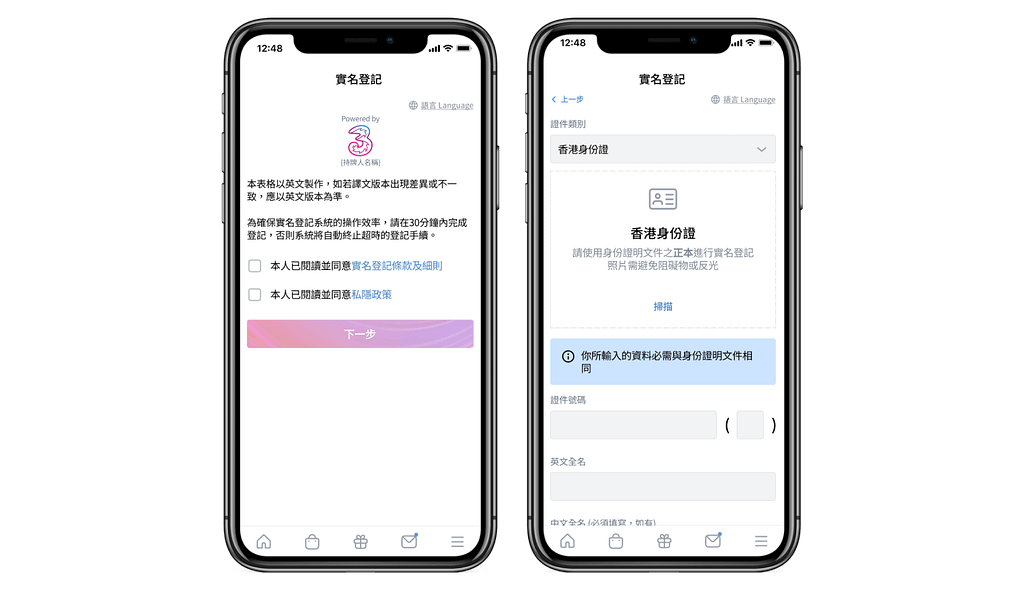
We’ve encountered complicated issues, such as the collection of prepayment under various conditions, which pose complexities both in terms of end-user comprehension and technical aspects. Despite these challenges, we strive to make the process more understandable and user-friendly.
I quickly mocked up some basic wireframes to gather feedback from product team, engineering team and the users on the overall layout and structure of the wizard form. This involved establishing a standardised visual hierarchy and layout for the future wizard component.
Validating the designs
Prototyping the subscription user flow helped us understand the emotional change and evaluate the effectiveness of communication with end users.
One of the complex features we had to create was to pay in advance and joining sharing plan during a new subscription. I conducted usability testing sessions with our primary users and observed how they interacted with the prototype in order to validate whether the new designs would solve their problems.
Area of improvement
The subscription process necessitates the user to enter various personal details. However, when using Figma for prototyping this flow, we encountered limitations as it doesn’t support the creation of an actual input form. Consequently, we were unable to obtain real-time feedback from users. This necessitated the need to explore other tools to effectively prototype the subscription flow.
Design and handoff
After the validation of the wireframe and testing the prototype, we focused on the interface elements. Initially, I crafted high-fidelity mockups using Sketch and created clickable prototype HTML. However, to facilitate a seamless handoff and convenient file sharing, we transitioned to Figma. This allowed the engineers to inspect the file and export the HTML and CSS code with ease.
I worked very closely with the Front End team to spec out any missing interactions that were originally covered in the high fidelity mockups. I conducted a UX review of each screen that was implemented to ensure it was aligned with the designs before it went live.

View detailed UI
Lesson learnt
- Be the bridge
While it’s essential to focus on delivering a user-centric design, it’s equally important to serve as a communication conduit between various stakeholders and teams. Collaborating closely with engineers has broadened my understanding of technical feasibility, enabling me to propose solutions to user issues that are both practical and technically sound. Additionally, I’ve been able to aid the product owner and marketing team in understanding the technical constraints, thereby assisting them in making the most effective business decisions. - Keep the balance
Given that this is a pioneering product of the digital transformation, some decisions are not solely focused on resolving end-user problems. Instead, they aim to establish the overarching structure of the entire business, which can result in a substantial scale. As a UX designer working on such a project, maintaining a balance between the user experience and the business objectives presents a significant challenge, yet it’s absolutely crucial.
You may also find interested!

